
If you've ever opened your dashboard, seen MRR go up, and still felt uneasy, that feeling is usually right. A single headline number can hide customer loss, pricing pressure, or a marketing mix that only looks healthy on the surface.
That's why a MRR breakdown matters. It turns one monthly total into a bridge you can inspect, so you can see whether growth came from new customers, expansion, reactivation, contraction, or churn, and whether the result is durable or fragile.
Table of Contents
- Why Net MRR Growth Can Mislead You
- The Standard MRR Bridge Formula
- What Each MRR Movement Actually Means
- Segmenting MRR by Plan, Source, and Cohort
- How Stripe and Paddle Handle MRR Timing Differently
- Building a Monthly MRR Reporting Workflow
- Common MRR Calculation Mistakes to Avoid
- Questions to Ask Every Month About Your MRR
Why Net MRR Growth Can Mislead You
A founder can look at the month-end number and think the business is getting stronger, then realize the path to that number is messy. Two SaaS companies can report the same net increase, but one gets there by replacing churn with new sales, while the other grows because current customers keep upgrading. Those are very different businesses, even if the top line looks similar.
That's the trap with a single MRR figure. It tells you the outcome, not the mechanism, and the mechanism is what you need if you're trying to fix growth quality. The useful question isn't just “did MRR rise?” It's “what moved it?”

I've seen teams celebrate a good month, then discover the new revenue was doing all the work while retention weakened underneath. That's where a bridge helps. It forces the month to reconcile into parts, and once you can see the parts, you can see whether acquisition is carrying the business or whether existing customers are doing the heavy lifting.
Practical rule: if the month looks good but you can't explain where the gain came from, you don't have a revenue report yet, you have a scoreboard.
For teams cleaning up messy billing and marketing data, it also helps to look at revenue leakage across billing systems so you can separate a reporting problem from an actual business problem. A number can drift for operational reasons before it ever becomes a retention issue.
The Standard MRR Bridge Formula
The standard MRR bridge starts with one period's MRR, adds the positive movements, subtracts the negative ones, and lands on ending MRR. The clean version is:
Starting MRR + New MRR + Expansion MRR + Reactivation MRR − Contraction MRR − Churned MRR = Ending MRR
That structure matters because each movement should only appear once. New MRR belongs to customers whose prior-period MRR was zero. Expansion MRR is the extra recurring value from upgrades, added seats, add-ons, or price changes. Reactivation MRR is revenue from customers who had churned and returned. Contraction MRR covers partial reductions while the account is still active. Churned MRR is the revenue lost when the subscription ends.
A simple example makes the math easier to trust. If a SaaS business starts the month at $50,000 MRR, adds $8,000 from new customers, gets $3,000 from upgrades, reactivates $1,000, loses $2,000 through downgrades, and loses $4,000 through cancellations, it ends at $56,000 MRR. The net increase is $6,000.
The important habit is classifying the movement, not just the invoice. A downgrade that stays active is contraction, not churn.
This is the part teams often skip when they build reports by hand. If a customer downgrades and later cancels, the bridge should show contraction first and churn only when the account fully ends. That's the only way the arithmetic stays honest across Stripe, Paddle Billing, Paddle Classic, Freemius, or a custom billing feed.
What Each MRR Movement Actually Means
New MRR and Expansion MRR
New MRR tells you how much fresh recurring revenue came from first-time paying customers. It's the closest thing to a pure acquisition signal, but it still needs context. If new MRR is strong and retention is weak, you may just be pouring water into a leaky bucket.
Expansion MRR works differently. It shows existing accounts are buying more, adding seats, or moving up plans. In practice, that's often a stronger sign of product fit than raw acquisition volume because the customer has already decided the product is worth more over time.
Contraction, churn, and reactivation
Contraction MRR is the early warning signal most founders should watch closely. A downgrade, seat reduction, or add-on removal can show up long before a full cancellation. If you track it by account and segment, you can see where value is softening before the customer disappears.
Churned MRR is the clean end of the relationship. Once the paid subscription ends, that revenue is gone, and the bridge should show it that way. Paddle's metrics also treat a returning customer as a reactivation rather than a new customer, which keeps the history of the relationship intact.
Reactivation MRR isn't nostalgia. It means a previously lost account came back and started contributing recurring revenue again. If reactivation shows up often, your win-back motion is doing real work.
The internal difference between these movements is why the dashboard needs more than one number. The wording matters because the business meaning changes with it. If you want a deeper walkthrough of upgrade and downgrade handling, the linked guide on how Chartsy detects MRR upgrades and downgrades is the right companion reading.
Segmenting MRR by Plan, Source, and Cohort
Aggregate MRR tells you what happened. Segmentation tells you why it happened. If you only look at the company-wide total, you can miss the fact that one plan is expanding nicely while another is bleeding through downgrades.
The right cuts to make
Break MRR movements by plan, acquisition source, country, and cohort. That gives you a practical way to ask whether growth quality differs across the business. A channel that brings fast-paying customers isn't necessarily a good channel if those customers contract quickly after onboarding.
Useful habit: compare movement by source, not just signups by source. Signups don't pay the bills, recurring customers do.
A segment view also shows where expansion is coming from. Some plans may rarely upgrade, while others repeatedly add seats. Some cohorts may churn early, while older cohorts stay steady and expand. Those patterns matter more than a company-wide average because they change how you spend on acquisition and where you invest in product work.
| Segment | Diagnostic Question | What It Reveals |
|---|---|---|
| Acquisition source | Which channels bring customers who expand instead of churn? | Whether traffic quality matches revenue quality |
| Plan tier | Which plans create the most contraction? | Where pricing or packaging may be too tight |
| Customer cohort | Do newer cohorts behave differently from older ones? | Whether onboarding, fit, or messaging is changing |
| Country | Are losses concentrated in one market? | Localization, payment, or support friction |
| Product line | Which offer drives the most reactivation? | Where win-back demand is strongest |
Chartsy is one option for this kind of workflow because it ties website traffic and signups to billing data from Stripe, Paddle Billing, Paddle Classic, and Freemius, then lets small teams review revenue movements through plain-English questions instead of spreadsheets. The linked overview on MRR by acquisition source fits especially well if you're trying to separate marketing performance from raw revenue totals.
How Stripe and Paddle Handle MRR Timing Differently
Stripe and Paddle both report recurring revenue, but they don't always treat timing the same way. That means the same customer action can show up differently depending on which billing system you use.
Stripe defines MRR as the monthly-normalized value of active and past-due subscriptions, while excluding taxes, free plans, and usage-based products. It stops counting a subscription when it's canceled or marked unpaid, which keeps the number focused on active recurring revenue.
Paddle uses a different churn timing rule. A customer is counted as churned when the paid subscription period ends, not when they click cancel. Paddle also treats a returning customer as a reactivation rather than a new customer. That distinction matters when a cancellation is scheduled for the end of a cycle, because the revenue doesn't drop until access ends.
The practical takeaway is simple. If your dashboard only records cancellation events, it can show churn too early. If it only watches invoice events, it can miss the timing of a real exit.
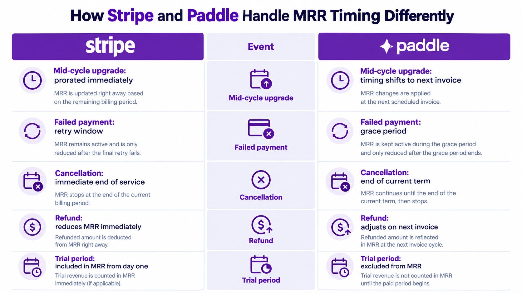
For teams wiring this into operations, the Stripe action configuration steps are useful when you want to understand how Stripe events get handled in a workflow. If you also use Paddle, the Paddle analytics guide is worth comparing so your reporting language stays consistent across platforms.
Building a Monthly MRR Reporting Workflow
A good monthly workflow doesn't start with charts, it starts with one question, “Do the movements reconcile?” If they don't, no amount of dashboard polish will save the report.
A simple operating rhythm
Pull billing data from Stripe, Paddle Billing, Paddle Classic, Freemius, or a custom API feed into one recurring view. Then review the bridge, the customer counts behind each movement, and the segment splits by source and plan. That gives you one place to see whether growth came from acquisition, expansion, or both.
Next, layer in marketing-source attribution so you can connect recurring revenue back to where the customer came from. If one channel produces lots of signups but weak expansion, it may be driving volume without durable value. If another channel brings fewer customers but stronger expansion, that channel may deserve more budget than the raw lead count suggests.
A plain-English AI layer helps here because it lowers the friction of asking better questions. Instead of exporting data and hoping a spreadsheet tells the story, you can ask what changed, where it changed, and which segment changed first.
Best workflow: review the bridge first, then ask why the bridge changed. If you start with marketing channels, you can talk yourself into a story before the numbers are checked.
For small teams without a dedicated analyst, the point is not fancy modeling. It's a repeatable monthly routine that shows which customers pay, which sources hold up over time, and where to dig deeper before a weak trend becomes an expensive one.
Common MRR Calculation Mistakes to Avoid
The most common mistakes are usually classification errors, not math errors. The formula is straightforward. The trouble starts when teams put the wrong event in the wrong bucket.
Mistakes that distort the report
- Counting unpaid trials as MRR: this inflates growth and hides the fact that no recurring revenue exists yet.
- Including one-time fees or setup charges: these are revenue, but they're not recurring subscription revenue.
- Mixing downgrade and churn events: if a customer is still active after reducing spend, that's contraction, not churn.
- Treating all cancellations as immediate churn: some billing systems only recognize churn when the paid period ends.
- Counting same-month signups and churns as both new revenue and churn: Paddle excludes users who sign up and churn within the same month from both MRR and churn numbers, which avoids double counting.
The symptom is usually a dashboard that looks too sharp. New MRR appears overstated, churn looks artificially high or low, and the bridge stops reconciling cleanly. The fix is to define each movement once and apply that definition everywhere, across plan changes, billing events, and reporting periods.
If you keep one rule in mind, keep this one: recurring revenue should only include recurring revenue. Everything else belongs somewhere else in the report, even if it came from the same customer.
Questions to Ask Every Month About Your MRR
A useful MRR review isn't a presentation, it's a checklist. The goal is to leave the meeting knowing what changed, where it changed, and whether the change is healthy.
Ask whether net new MRR matches the sum of its parts. If it doesn't, the bridge has a classification problem. Ask which acquisition source brings the most expansion revenue, not just the most signups, because the source that drives revenue quality often looks different from the source that drives volume.
Then compare contraction and churn. If contraction is rising faster, you may be seeing customer value soften before cancellation shows up. Finally, compare cohorts over time so you can tell whether newer customers behave differently from older ones.
A strong monthly habit is simple:
- Check the bridge first, to make sure the numbers reconcile.
- Check source quality second, to see which channels bring paying customers that expand.
- Check segment drift third, to catch plan or cohort issues early.
- Check churn timing last, so billing rules don't distort the story.
That shift from tracking revenue to diagnosing revenue is the point of the whole exercise. Once you can read the movements clearly, MRR stops being a vague monthly score and becomes a practical management tool.
If you want a cleaner way to connect billing data, traffic, signups, and recurring revenue, Chartsy is built for that workflow. It helps SaaS teams break down MRR by movement and segment, then read the results in plain English without living in spreadsheets.

Written by
Chartsy TeamAnalytics team at Chartsy
The Chartsy Team writes guides, product updates, and resources to help SaaS and eCommerce founders make sense of their metrics, without SQL or spreadsheets.
Chartsy